BAZTER PRO logo
Back to cases
Website case

Vyshyta Kartyna - Product Catalog Website

Vyshyta Kartyna is a product catalog website case for visual products, where item presentation, catalog flow, responsive screens, and a clear path to choosing handmade work are the main focus.

Product catalog
Catalog
Responsive
Visual catalog
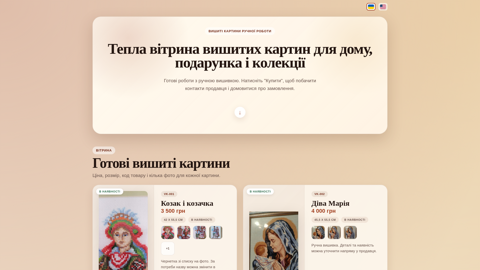
Vyshyta Kartyna - Product Catalog Website desktop preview
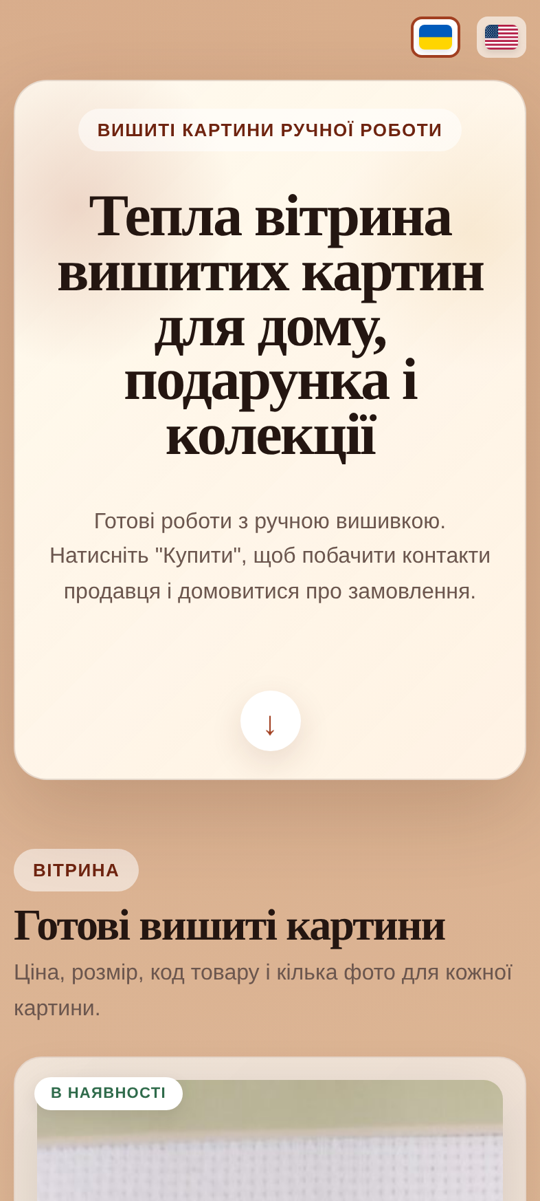
Vyshyta Kartyna - Product Catalog Website mobile preview

What was done

  • Presented the case around a product catalog website with item-focused content and catalog navigation.
  • Prepared desktop and mobile screenshots that emphasize visual product discovery.
  • Outlined catalog elements: visual product presentation, category flow, responsive layout, and clear paths to contact or choose an item.
  • Kept the case in the website catalog as a detailed portfolio item instead of a removed project page.

Result

  • The case shows the website as a visual catalog for handmade and product-focused content.
  • Responsive screenshots make the catalog experience clear across desktop and mobile.
  • The website catalog stays clean while still preserving a detailed case page.

Screenshots

Desktop screen
Vyshyta Kartyna - Product Catalog Website Desktop screen
Mobile screen
Vyshyta Kartyna - Product Catalog Website Mobile screen

FAQ about the Vyshyta Kartyna catalog case

What kind of website does this case describe?

A product catalog website for visual handmade items with category flow, item presentation, and a clear path to contact or choose a product.

Why is visual presentation emphasized?

The catalog depends on strong imagery, responsive layouts, and readable product blocks so buyers can compare items quickly.

How do desktop and mobile views help here?

Screenshots show how product discovery works across devices before a visitor needs to open an external site.

Where is this case listed?

It stays in the BAZTER PRO website catalog as a detailed portfolio page with work summary, results, and previews.

How a product catalog website case was presented

Steps to showcase a visual catalog with item-focused content, responsive screens, and portfolio navigation.

  1. Frame the catalog around product discovery

    Focus copy and screenshots on categories, item cards, and paths to contact or selection.

  2. Prepare desktop and mobile catalog screenshots

    Highlight visual product presentation and navigation on large and small screens.

  3. Describe catalog structure and responsive layout

    Explain category flow, visual blocks, and layout decisions that support handmade products.

  4. Keep a detailed page inside the website catalog

    Preserve the case as a portfolio item with its own URL instead of a removed legacy project page.